Synthetix Knowledge Management Best Practice Guide

Why Metrics Are Key To Knowledge Management
You can’t improve what you can’t measure. The capability to interpret knowledge management data and subsequently make key decisions based on what is found is paramount to business efficiency.
External Knowledge Metrics
Once an article has been published it is good practice to regularly evaluate its effectiveness. Wait an appropriate amount of time so that there is sufficient data to analyse. This will depend on the nature of your analysis, and sometimes you have to work on low levels of data, but if you can, wait until you have confidence in your sample size.
Navigate to the Metrics section of your account, choose External Knowledge and access the following reports:
These reports pull data on the usage of content from both FAQ tools and bots – you can filter by product at the top of the page.
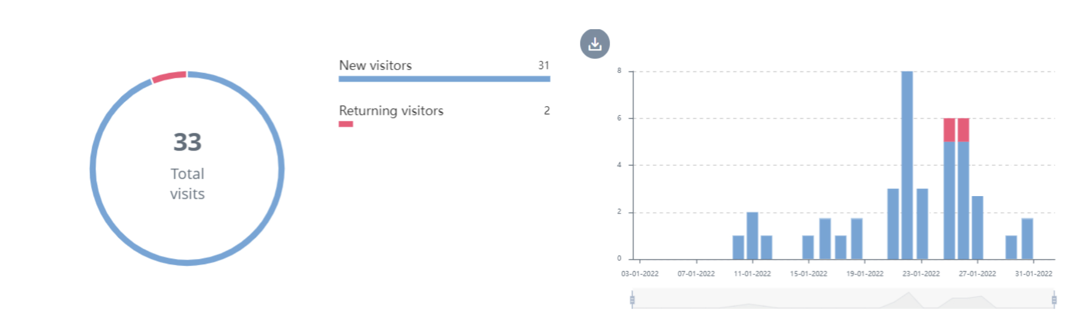
Visitors
Choose your instance, product and date range to see visitor data.
Visitors shows you the total number of new and returning visitors that used your FAQ or chatbot software over time. Use the pie of bar graph for data at a glance or the table for a breakdown of daily visits per new and returning.
Using the Visitors reports help you to identify high traffic spikes that can be an early warning sign there is a fatal issue with your product/service.
Use Case
You notice a sudden spike in visitors so you check the Top Articles report. Here it tells you that there has been a spike in clicks to the “What is your returns policy?”, signalling that there could be an issues with your product affecting the masses. You investigate further from here.
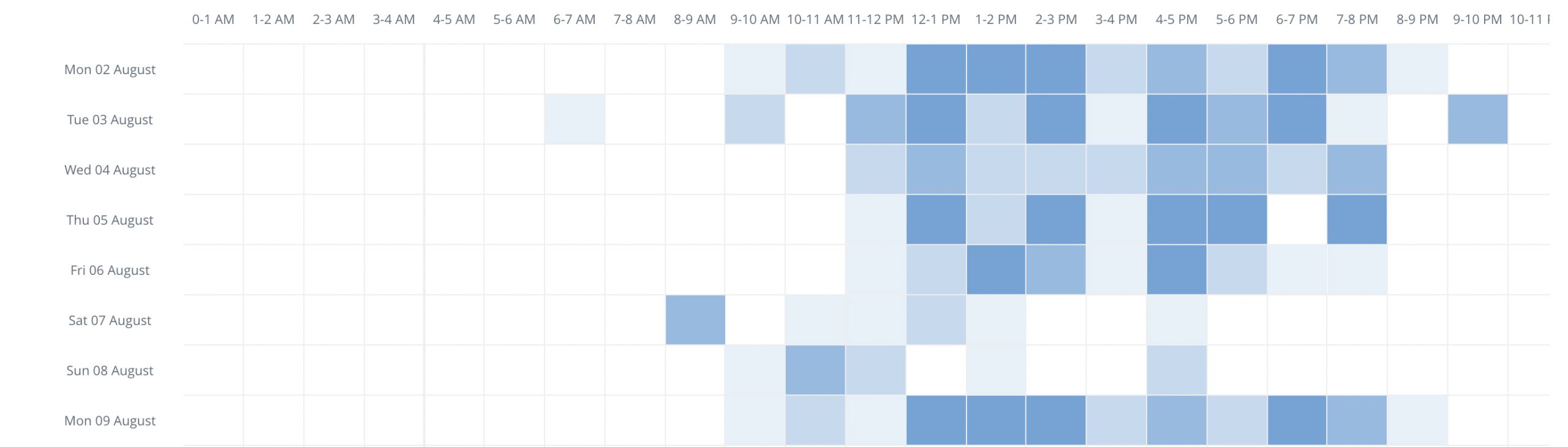
Interactions
Choose your instance, product and date range to see interactions data.
This report shows you the most popular times and days in which your visitors use your tools. Presented in a grid format, you can filter by day to get a more granular breakdown of peak hours.
This report helps to show you the effectiveness of your FAQ and chatbot technology. It outlines time periods in which many interactions occur – interactions that would otherwise reach the contact centre and cost significantly more to handle.
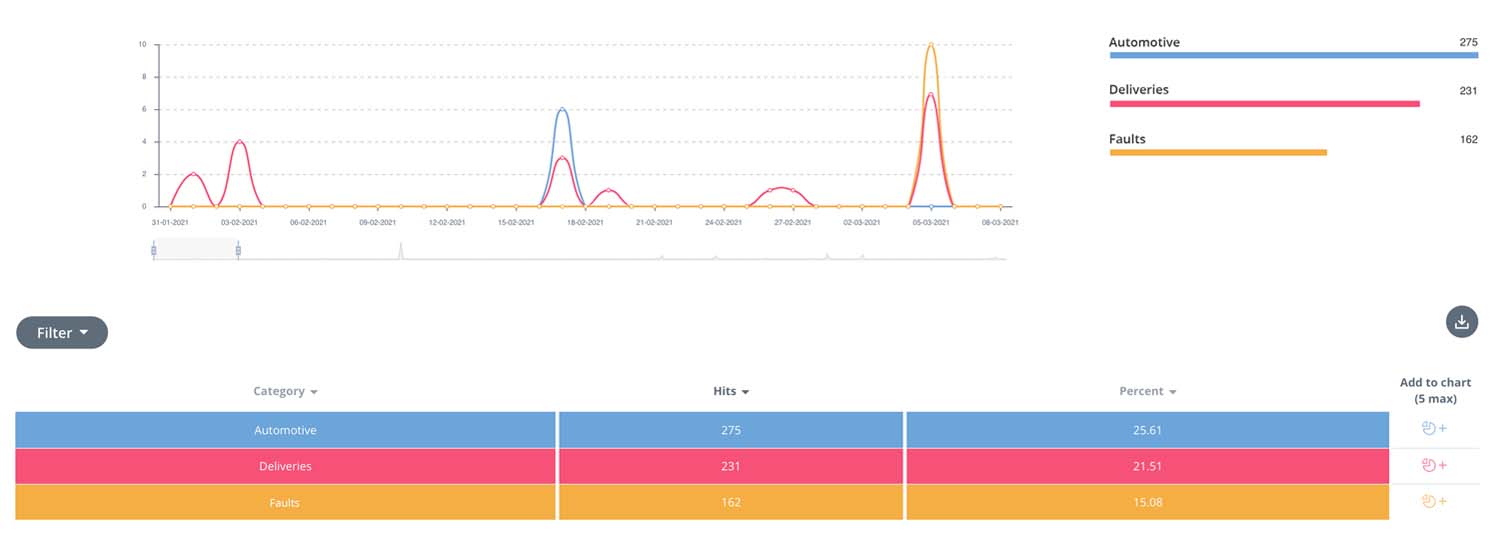
Top Categories
Choose your instance, product and date range to see top category data.
You can add categories to the report to see which received the most visitors over time whilst looking out for intelligence.
For instance, if you notice any irregular fluctuations in this report, for example, one category that usually has little traffic, suddenly spikes, you can use this data as guidance.
Perhaps something externally has occurred that affects you and your business, creating an influx of traffic to a specific article/s within a category. The same applies internally if you have an internal employee knowledge base for your company.
Use Case
You notice that the category “Faults” has unusually high traffic. To investigate further, you look at Top Articles and see that the article, “What shall I do if my product is faulty?” also has unusually high traffic, signalling that you have a faulty product. You investigate this further with the Product team.
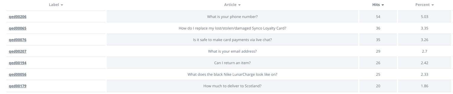
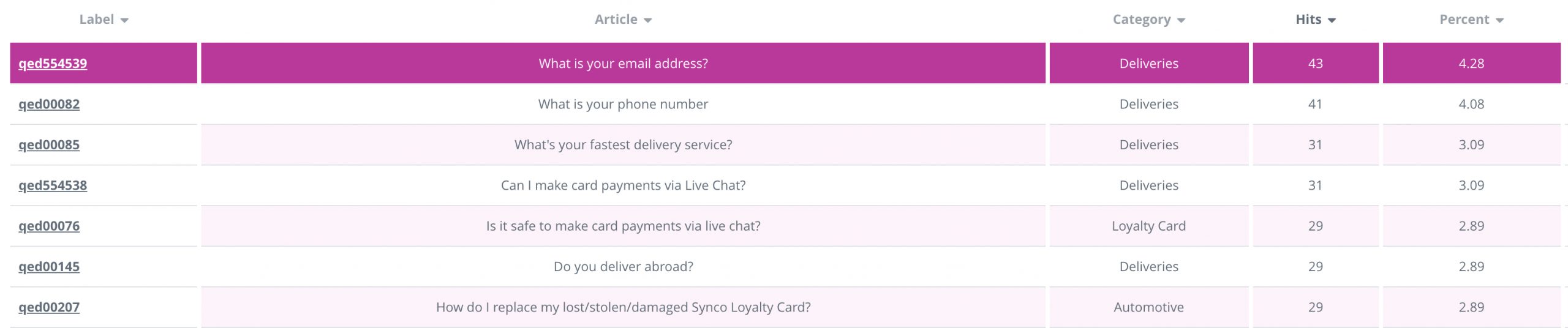
Top Articles
Choose your instance, product and date range to see top articles data.
Top Articles reports show you how many clicks each article has received over time. Similar to the Top Categories report, you can select different articles to appear within the graph.
If an article has had little or no visitors it is good practice to:
- Revisit the article in Editor. Make sure the article title matches the intent of the FAQ.
- Consider if the article is in fact an FAQ, if it continues to receive no visitors perhaps it is no longer relevant to customers.
The report also provides you with an insight into your customers’ behaviour and what they need help with. This in turn can help inform a better CX.
Use Case
You notice that one article in particular “What is your phone number” is consistently receiving the most hits. If a customer is having to use self-service to find a phone number, the CX is not particularly smooth. Therefore you make it a priority to include the phone number in more visible places across the site.
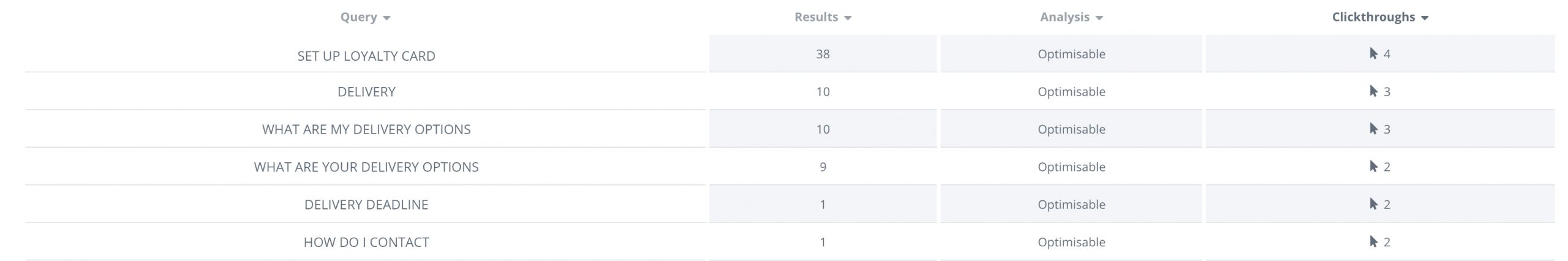
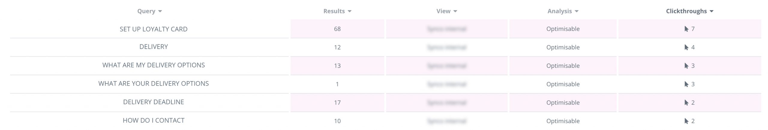
Search Results
Choose your instance, product and date range to see feedback data. This is where you can find what your site visitors have been using your FAQ and chatbot tools to search for.
This is particularly useful in optimising your content. It helps identify areas for improvements as well as new articles that should be built based on top search results.
Use Case
Having looked at your Search Results table, you notice that “set up loyalty card” has the most hits. You don’t currently have an FAQ that explains how to set up a loyalty card and therefore create one to improve CX.
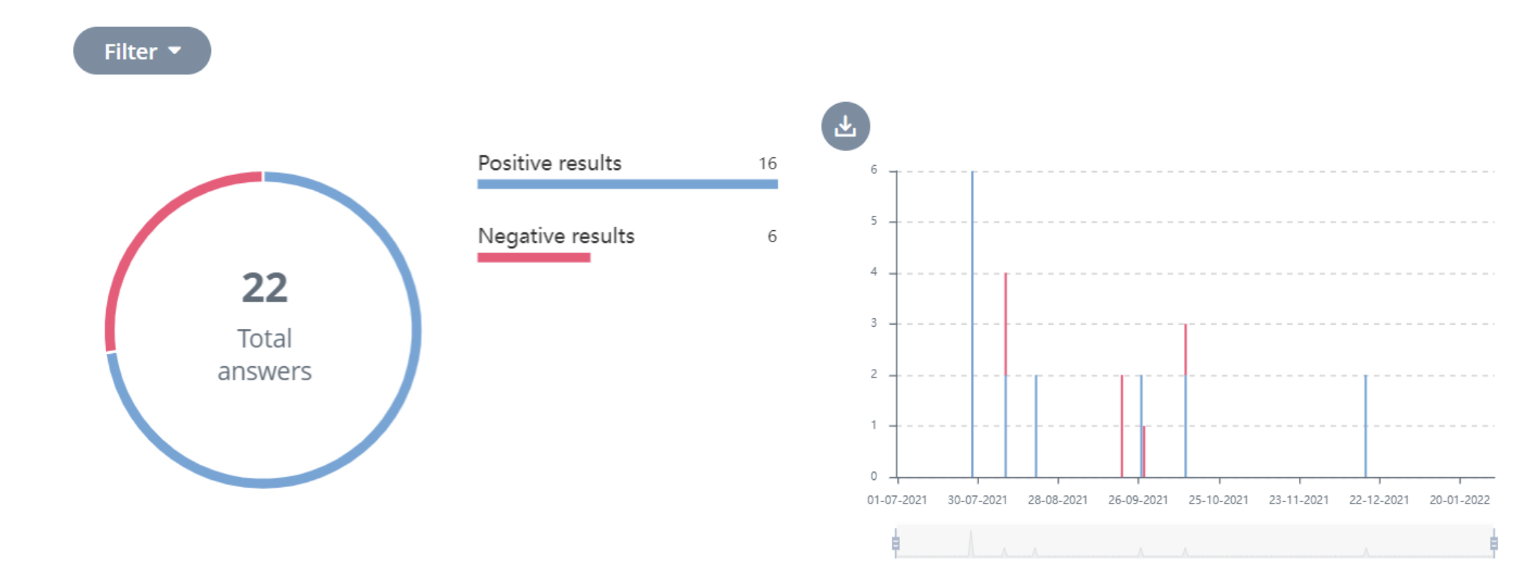
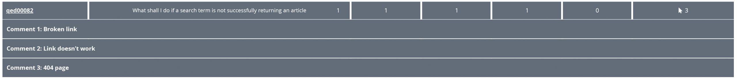
Feedback
Choose your instance, product and date range to see feedback data. This is where you will find the ratio between positive and negative feedback, the articles that received positive/negative feedback and comments as to why (if a user has chosen to leave feedback).
This report helps you see which articles may include irrelevant, unclear or inaccurate information and therefore need improving.
Use Case
For instance, you check the report this week to find that the article with the most negative feedback is a popular FAQ. You check the comments that mention more than once that the link inside does not work. There was an error that was identified and can easily be fixed.
Internal Knowledge Metrics
Where your External Knowledge metrics help to identify how website visitors are behaving and interacting with your FAQ tools, your Internal Knowledge metrics differ. They help to demonstrate how agents are interacting with the knowledge base whilst serving customers. Internal Knowledge metrics also help to monitor agent performance and usage of tools.
Analysing internal knowledge metrics helps to understand what exactly operators are helping customers with whilst measuring performance and contact centre efficiency helps inform decisions based on CX, HR and training.
Navigate to the Metrics section of your account, choose Internal Knowledge and access the following reports:
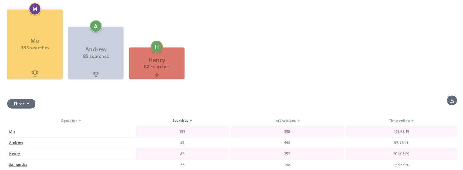
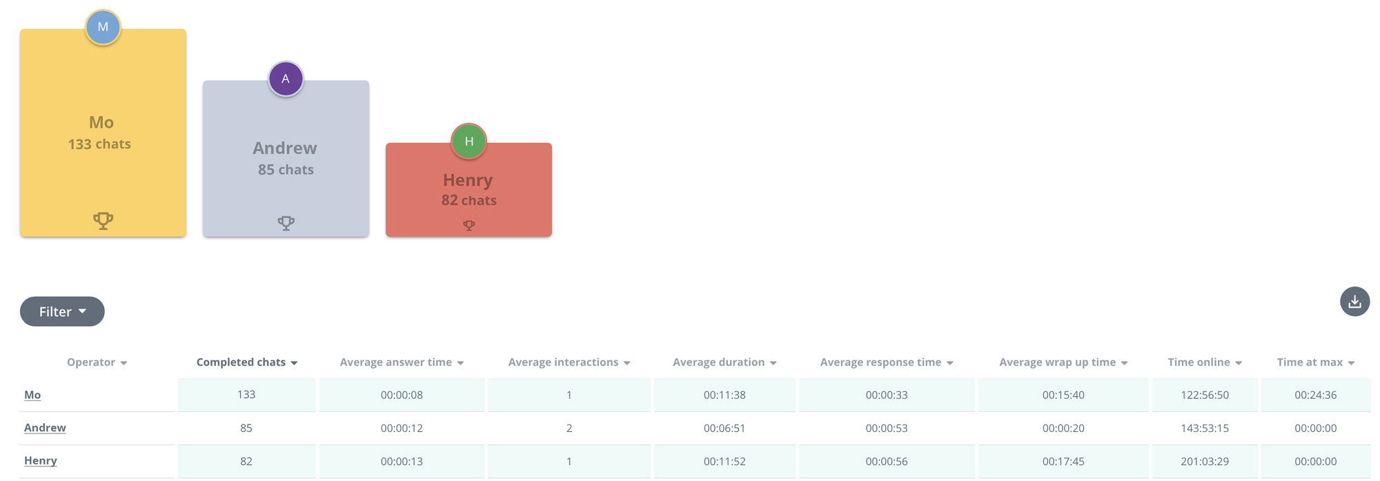
Operator’s Summary
Choose a date range to see operator’s summary data. This is where you can see operators’ performance at a glance.
Leader board data shows us the top-performing operators – those that have completed the most searches during a time period. This leader board data is available for agents to see so that they know how their performance compares with others.
A more detailed breakdown of operators’ performance can also be viewed like a scoreboard using filters to quickly find individual data. This is where you can see the total searches, interactions and time spent online per agent.
Operator’s Summary helps you harness agent efficiency.
Use Case
Once you have defined what good performance looks like, you identify that Mo matches that criteria. You ask Mo to take you through his methods to find out exactly what he is doing so well so that this can be applied to others.
Top Categories
Choose your instance, product and date range to see top category data.
You can add categories to the report to see which received the most visitors over time whilst looking out for intelligence.
For instance, if you notice any irregular fluctuations in this report, for example, one category that usually has little traffic, suddenly spikes, you can use this data as guidance.
Perhaps something externally has occurred that affects you and your business, creating an influx of traffic to a specific article/s within a category. The same applies internally if you have an internal employee knowledge base for your company.
Use Case
You notice that the category “Faults” has unusually high traffic. To investigate further, you look at Top Articles and see that the article, “What shall I do if my product is faulty?” also has unusually high traffic, signalling that you have a faulty product. You investigate this further with the Product team.
Top Articles
Choose your instance, product and date range to see top articles data.
Top Articles reports show you how many clicks each article has received over time. Similar to the Top Categories report, you can select different articles to appear within the graph.
If an article has had little or no visitors it is good practice to:
- Revisit the article in Editor. Make sure the article title matches the intent of the FAQ.
- Consider if the article is in fact an FAQ, if it continues to receive no visitors perhaps it is no longer relevant to customers.
The report also provides you with an insight into your customers’ behaviour and what they need help with. This in turn can help inform a better CX.
Use Case
You notice that one article in particular “What is your customer service email address” is consistently receiving the most hits. If a customer is having to ask an agent for the customer service email address, the CX is not particularly smooth. Therefore you make it a priority to include the email address in more visible places across the site.
Search Results
Choose your instance, product and date range to see feedback data. Here you can see the queries that your agents have been typing into the internal knowledge base when helping customers via live chat or telephone to solve queries.
This is particularly useful in optimising your content. It helps identify areas for improvements as well as new articles that should be built based on top search results.
Use Case
Having looked at your Search Results table, you notice that “set up loyalty card” has the most hits. You don’t currently have an FAQ that explains how to set up a loyalty card and therefore create one to improve CX.
Live Chat Metrics
Live Chat metrics contain a number of reports that help create a clear idea of how live chat is performing online, how it can be improved, how customers are using it and how agent performance can be optimised.
Navigate to the Metrics section of your account, choose Live Chat and access the following reports:
Operator’s Summary
Choose a date range to see operator’s activity data. This is where you can see operators’ performance at a glance.
Leader board data shows us the top-performing operators – those that have completed the most searches during a time period. This leader board data is available for agents to see so that they know how their performance compares with others.
A more detailed breakdown of operators’ performance can also be viewed like a scoreboard using filters to quickly find individual data. This is where you can see the total searches, interactions and time spent online per agent.
Operator’s Summary helps you harness agent efficiency.
For instance, once you have defined what good performance looks like, you identify that Mo matches that criteria. You ask Mo to take you through his methods to find out exactly what he is doing so well so that this can be applied to others.
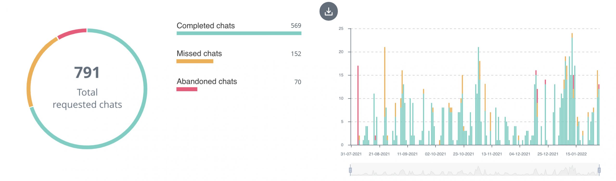
Chat Activity
Choose a date range to see chat activity data. This is where you can find the data that tells you over time, how many chats were:
- Completed: Once the customer has left, the agent completes the wrap-up and marks it completed.
- Missed: The agent does not take a chat and the customer leaves.
- Abandoned: The customer leaves the chat unexpectedly without a resolution being reached.
By comparing the number of completed chats and the number of missed chats against what you have deemed normal, you can put measures in place to make sure customer queries are being dealt with.
Use Case
For instance, you notice that the number of missed chats are higher than what you consider a normal rate. You decide to first check-in with the agent to assess whether any technical problems are occurring. Otherwise, you assign more agents to days where missed chats are high due to capacity issues.
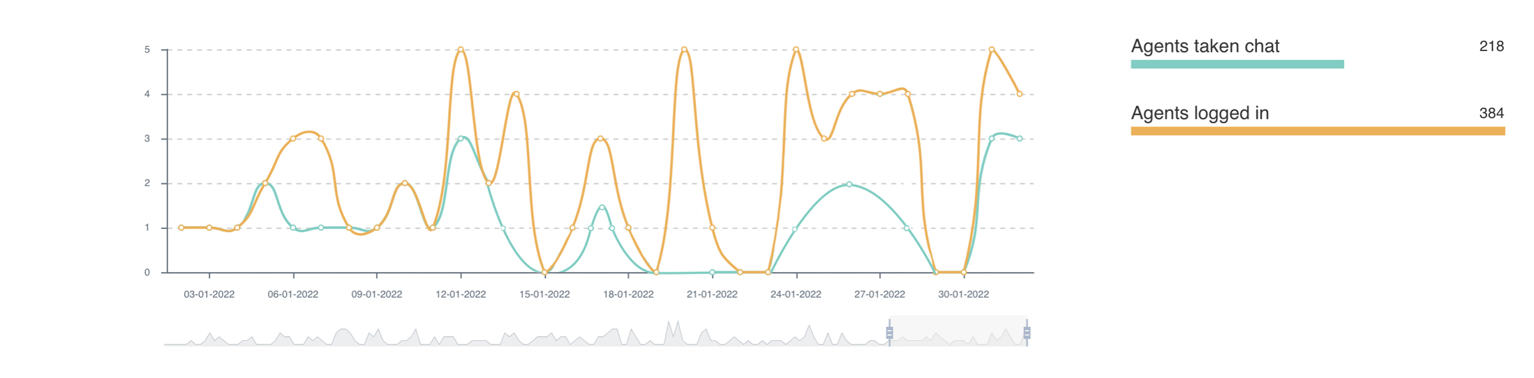
Operator’s Activity
Choose a date range to see operator’s activity data. This is where you can see the total agents that were logged in over a period of time vs how many of them were engaged in chats during this period of time.
This report is useful in projecting staff and demonstrating how much live chat is used.
Use Case
For instance, you notice a large gap in the data between agents logged in and chats taken which indicates that too many agents were available on that particular day. This can help with the more efficient projection of live chat staff.
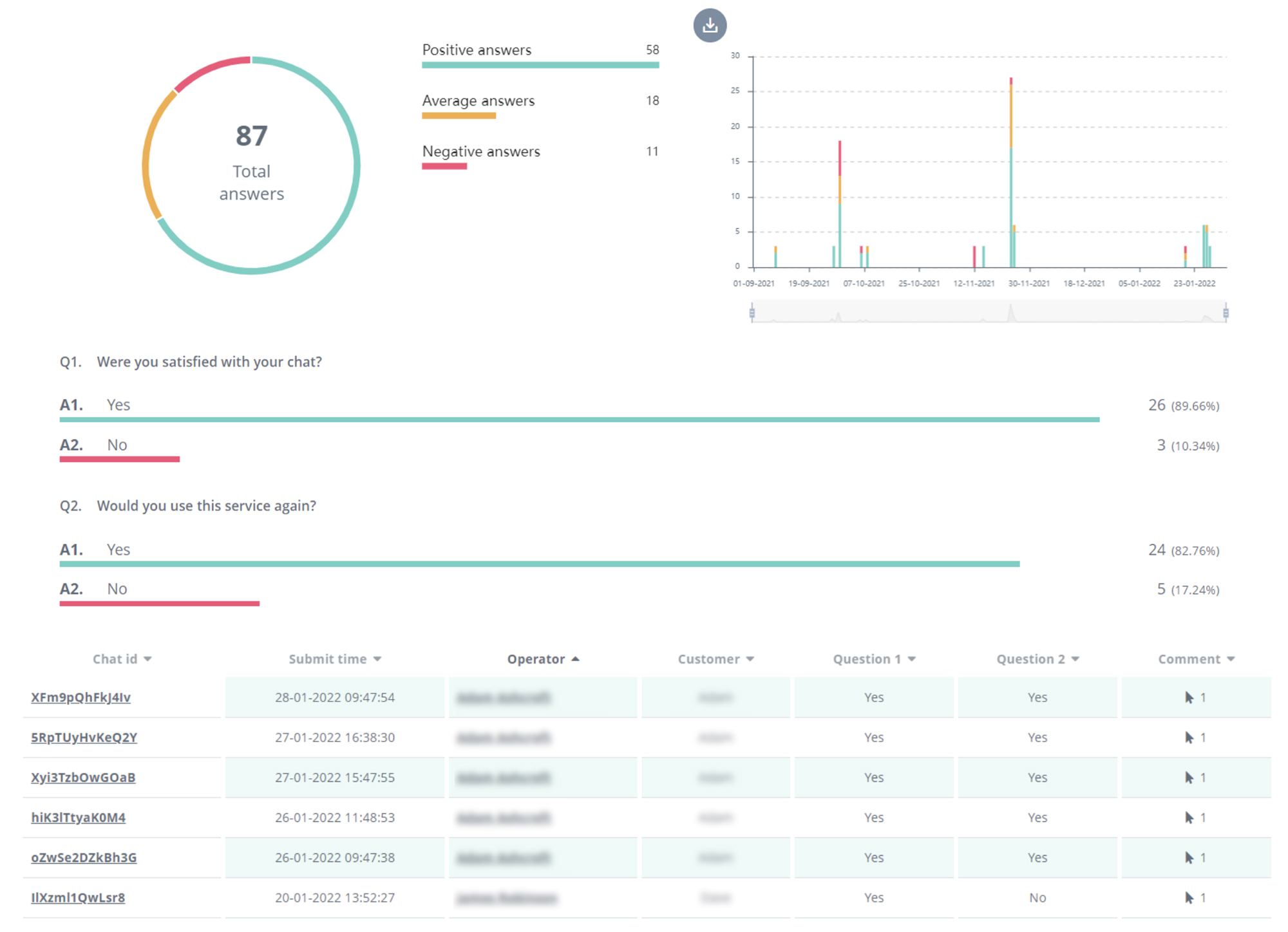
Feedback
Choose a date range to see feedback data. This is where you will find the ratio between the positive and negative feedback left by customers. This gives insight into the overall customer experience, agent performance and resolution effectiveness.
You can view the data at a glance, as a timeline and explore feedback further by viewing any comments that customers lefts after the chat ended. This feedback helps to identify any potential issues/wins and ways in which they can be solved/ harnessed.
Use Case
You notice that one particular agent has consistently been receiving excellent feedback celebrate this, asking them to share some tips with the rest of the team.
Conversely, if an agent is receiving consistently poor feedback, this is something to be investigated.
Chat Capacity
Chat Capacity metrics demonstrate live data and therefore don’t require the selection of a specific date range. Here you will see in chat slot capacity in real-time and how close you are to maximum slot capacity.
Use Case
For instance, if you have 10 agents logged in, each with 2 slots the total maximum capacity is 20 chats. You see that the slot capacity nearing 20 and consequently assign more slots or agents in order to fulfil demand.
 Synthetix Ltd, The Stansted Centre, Parsonage Road, Takeley, Essex, CM22 6PU
 +44 1279 555 580
 uk@synthetix.com